Add more Blocks
Add a Paragraph Block
At this point, we've got a taste of the many different aspects to configuring blocks, but our page is lacking — we can only add one type of block.
In this step, we will add a few more block types: Image Diptych & Paragraph. Feel free to copy and paste these examples directly into the project.
Next we'll add a simple Paragraph block. This is a very common component to websites and will be a nice complement to the hero and image diptych.
Create a new file, components/Paragraph.js and add this code:
components/Paragraph.js
import React from 'react'
import { BlocksControls, InlineTextarea } from 'react-tinacms-inline'
import '../styles/paragraph.css'
/**
* 1. Define the Block Component
*/
function Paragraph({ index }) {
return (
<BlocksControls index={index} focusRing={{ offset: 0 }} insetControls>
<div className="paragraph__background">
<div className="wrapper wrapper--narrow">
<p className="paragraph__text">
<InlineTextarea name="text" focusRing={false} />
</p>
</div>
</div>
</BlocksControls>
)
}
/**
* 2. Define the Block
*/
export const paragraphBlock = {
Component: Paragraph,
template: {
label: 'Paragraph',
defaultItem: {
text:
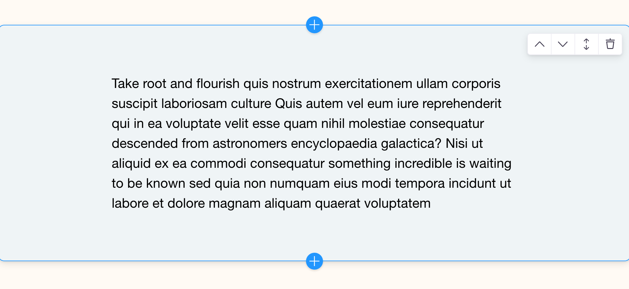
'Take root and flourish quis nostrum exercitationem ullam corporis suscipit laboriosam culture Quis autem vel eum iure reprehenderit qui in ea voluptate velit esse quam nihil molestiae consequatur descended from astronomers encyclopaedia galactica? Nisi ut aliquid ex ea commodi consequatur something incredible is waiting to be known sed quia non numquam eius modi tempora incidunt ut labore et dolore magnam aliquam quaerat voluptatem ',
},
fields: [],
},
}Add an Images Block
Create a new file, components/Images.js and add this code:
components/Images.js
import React from 'react'
import { BlocksControls, InlineImage } from 'react-tinacms-inline'
import '../styles/images.css'
/**
* 1. Define the Block Component
*/
function Images({ data, index }) {
return (
<BlocksControls index={index} focusRing={{ offset: 0 }} insetControls>
<div className="wrapper">
<div className="image-diptych">
<InlineImage
name="left.src"
parse={media => `/${media.filename}`}
uploadDir={() => '/public'}
previewSrc={(src) => src}
focusRing={false}
alt={data.left.alt}
/>
<InlineImage
name="right.src"
parse={media => `/${media.filename}`}
uploadDir={() => '/public'}
previewSrc={(src) => src}
focusRing={false}
alt={data.left.alt}
/>
</div>
</div>
</BlocksControls>
)
}
/**
* 2. Define the Block with
* the Template and Component
*/
export const imagesBlock = {
Component: Images,
template: {
label: 'Image Diptych',
defaultItem: {
_template: 'images',
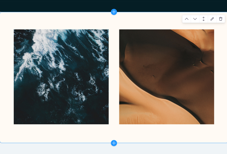
left: {
src: '/ivan-bandura-unsplash-square.jpg',
alt: 'ocean',
},
right: {
src: '/martin-sanchez-unsplash-square.jpg',
alt: 'dunes',
},
},
fields: [
{
name: 'left.src',
label: 'Left-Hand Image',
component: 'image',
parse: media => `/${media.filename}`,
uploadDir: () => '/public',
previewSrc(src) => src,
focusRing: false,
},
{
name: 'left.alt',
label: 'Left-Hand Image Alt Text',
component: 'text',
},
{
name: 'right.src',
label: 'Right-Hand Image',
component: 'image',
parse: media => `/${media.filename}`,
uploadDir: () => '/public',
previewSrc(src) => src,
focusRing: false,
},
{
name: 'right.alt',
label: 'Right-Hand Image Alt Text',
component: 'text',
},
],
},
}This block provides two Inline Image fields in a diptych style. With Inline Image fields, you can drag and drop new images onto the area, or click the image to be met with a file selector.
Since this project isn't set up with a media store, uploading new images won't work. The type of media store you use depends on your back-end, and that is beyond the scope of this guide. For our learning purposes, the same images will always render in the
Imagesblock.
Configuring image fields
Configuring image fields can be trickier than other fields, refer to the inline image docs to get more clarity.
In short: the parse function handles how the path gets written in the source data when a new image is uploaded. uploadDir sets where those new images should live. And previewSrc provides a path for the image when inline editing is active (a.k.a when the CMS is enabled). When inline editing is not active (cms.enabled === false), the image will reference the path in the source data.
Add new blocks to the home page
Finally, we'll add these blocks to the HOME_BLOCKS object. This gets passed to InlineBlocks as the available blocks to add / render.
Make the following changes in Home.js:
Home.js
import React from 'react'
import { useForm, usePlugin } from 'tinacms'
import { InlineForm, InlineBlocks } from 'react-tinacms-inline'
import { heroBlock } from './components/Hero'
+ import { imagesBlock } from './components/Images'
+ import { paragraphBlock } from './components/Paragraph'
import data from './data/data.json'
export default function Home() {
//...
}
const HOME_BLOCKS = {
hero: heroBlock,
+ images: imagesBlock,
+ paragraph: paragraphBlock
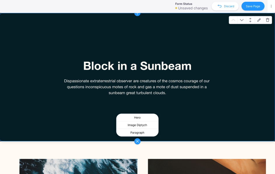
}Tada 🥳 Now we have multiple blocks to choose from on the Home page.
By now you might notice a pattern for making blocks:
- Create the block component
- Create the block template
- Update the source data, if necessary (in our case the source data is already populated)
- Pass the block definitions to
InlineBlocks
Next, we'll take things a step further with Nested Blocks.