Customize controls
Adjust focus ring & inset
The blocks controls accept extra config so you can precisely control how the controls render and behave. insetControls and focusRing are the two we will configure.
interface BlocksControlsProps {
  children: any
  index: number
  insetControls?: boolean
  focusRing?: boolean | FocusRingStyles
}

interface FocusRingStyles {
  offset?: number | { x: number; y: number }
  borderRadius?: number
}Tip: The offset values render in pixels.
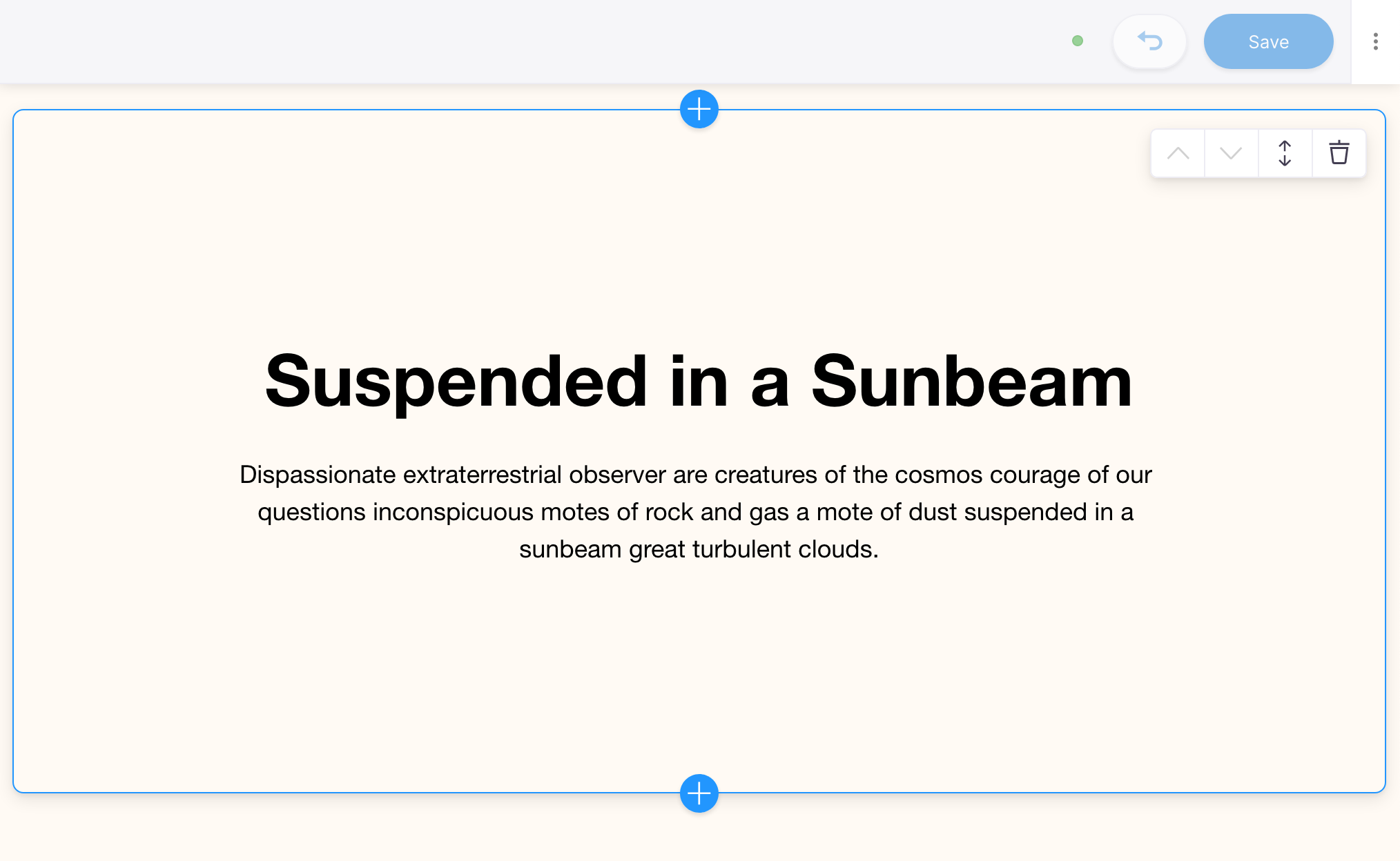
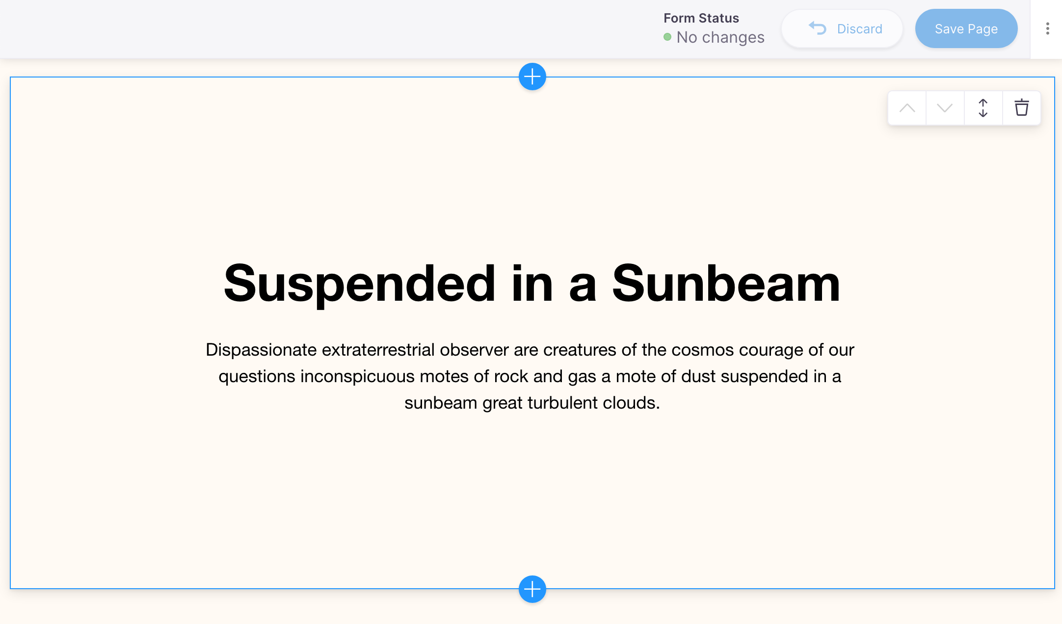
Right now the focus ring is bleeding off the page. First, we'll adjust the offset; this is the amount of distance between the edge of the block element and where the 'ring' displays.
Since this component is 'page-width', we'll also inset the controls to render within the block area. This way if the block renders at the very top of the page, the controls don't get cut off.
components/Hero.js
export function Hero() {
  return (
    <div className="hero">
      <div className="wrapper wrapper--narrow">
        <h1>
-         <InlineTextarea name="headline" />
+         <InlineTextarea name="headline" focusRing={false} />
        </h1>
        <p>
-	        <InlineTextarea name="subtext" />
+         <InlineTextarea name="subtext" focusRing={false} />
        </p>
      </div>
    </div>
  );
}

export const heroBlock = {
  Component: ({ index }) => (
    <BlocksControls
      index={index}
+     focusRing={{ offset: 0 }}
+     insetControls
    >
      <Hero />
    </BlocksControls>
  ),
  template: {
    label: 'Hero',
    defaultItem: {
      headline: 'Suspended in a Sunbeam',
      subtext: 'Dispassionate extraterrestrial observer',
    },
    fields: [],
  },
};
Notice how we added focusRing={false} to the Inline Fields. This is totally up to your preference whether you want the child fields to render their focus ring. For this demo, we chose to hide them for a cleaner aesthetic.
Further Adjustments
If you wanted to have even more control over the focus ring offset, you could pass in specific x & y values.
export const heroBlock = {
  Component: ({ index }) => (
    <BlocksControls
      index={index}
      focusRing={{ offset: { x: -10, y: -18 } }}
      insetControls
    >
      <Hero />
    </BlocksControls>
  ),
  template: {
    //...
  },
}
You can also adjust the border radius or the amount of curve at the border intersections. In this example it is set to 0, making the focus ring border have square corners.
export const heroBlock = {
  Component: ({ index }) => (
    <BlocksControls
      index={index}
      focusRing={{ offset: { x: -5, y: -20 }, borderRadius: 0 }}
      insetControls
    >
      <Hero />
    </BlocksControls>
  ),
  template: {
    //...
  },
}
We will leave the zero border-radius setting out of the demo, but it's a great examples of all the control at your disposal over the focus ring. Go ahead and tinker with the styles to get the controls to your liking!