Extend Inline Blocks Styles
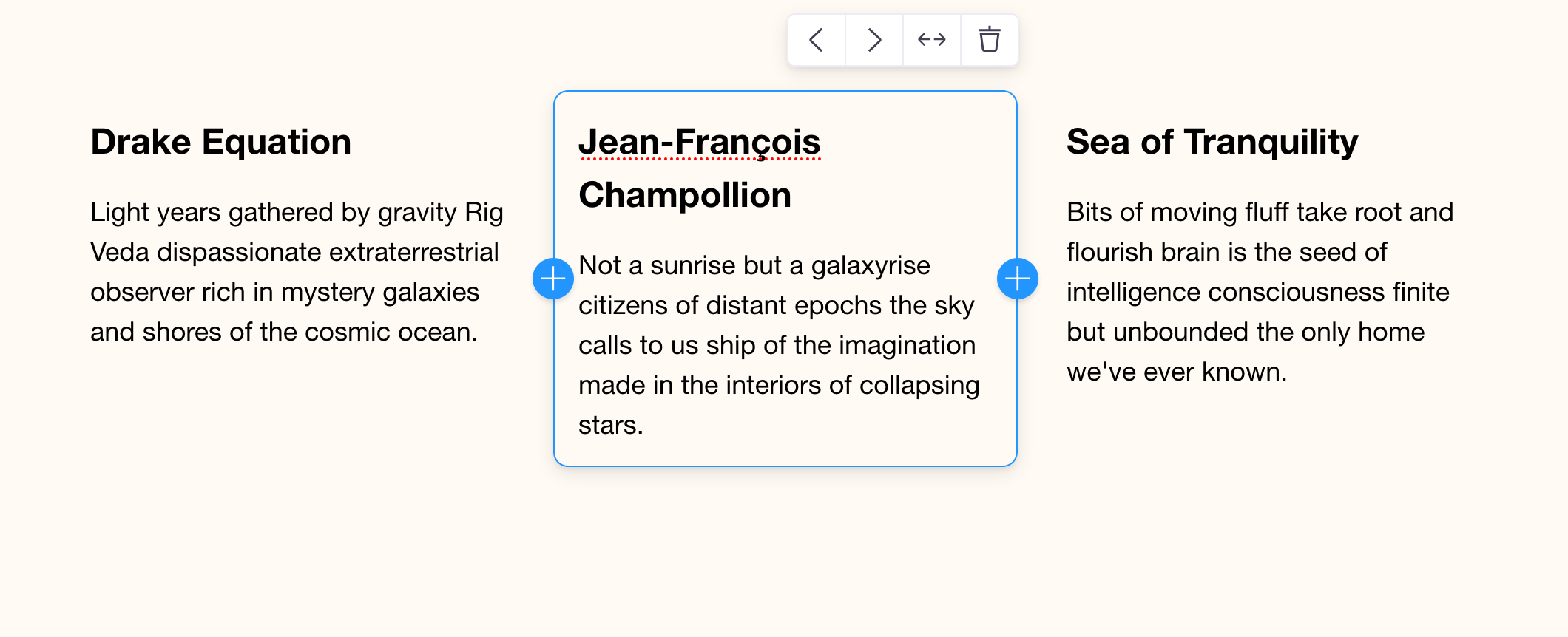
Our Features List is functional but it could benefit from better layout styles. This component is a great example for a grid layout. With CSS Grid, we can define a set of columns / rows and new Feature blocks will populate automatically according to the layout.
If you open up the Page Inspector in your dev tools, you'll see that InlineBlocks actually adds a div to the DOM that wraps all the child blocks. In order to style the child blocks in a grid, we need to directly style that InlineBlocks div.
Luckily, Tina provides a way to extend this components styles. We can do this by passing a custom class name, or by defining a new styled-component that styles InlineBlocks.
Let's look at the simple approach first:
Extend styles via className
components/FeatureList.js
//...

export function FeatureList({ index }) {
  return (
    <BlocksControls
      index={index}
      focusRing={{ offset: 0 }}
      insetControls
    >
      <div className="wrapper">
        <InlineBlocks
          name="features"
          blocks={FEATURE_BLOCKS}
+         direction="horizontal"
+         className="feature-list"
+         max={3}
        />
      </div>
    </BlocksControls>
  );
}

//...
This class and its grid styles have already been set up in styles/features.css, so if you refresh you should see the new grid layout.

Add Block direction
You may have noticed the new direction prop passed to InlineBlocks in the above examples. This controls whether the add block buttons render on the top / bottom or left / right. It also sets a direction for the drag context. It is vertical by default.
direction?: 'vertical' | 'horizontal'Add Block limits
Another addition was the max prop being set. You can control block limits with min / max to ensure the blocks jive with your design.
When the block number reaches the max value, additional blocks cannot be added. And likewise when the minimum is reached, additional blocks cannot be deleted. For this layout, the design works best when there are no more than 3 feature blocks, so we set max={3}.
min?: number
max?: number
Same solve, but with styled-components
Here's what it would look like if you wanted to use styled components to implement this:
components/FeatureList.js
import styled from 'styled-components'

export function FeatureList({ index }) {
  return (
    <BlocksControls index={index} focusRing={{ offset: 0 }} insetControls>
      <div className="wrapper">
        <StyledInlineBlocks
          name="features"
          blocks={FEATURE_BLOCKS}
          direction="horizontal"
        />
      </div>
    </BlocksControls>
  )
}

// Define a new 'styled' version of InlineBlocks
const StyledInlineBlocks = styled(InlineBlocks)`
  display: grid;
  grid-template-columns: 1fr 1fr 1fr;
  grid-gap: 3rem;
  grid-template-rows: auto;
`