Settings Modal Fields
Configure meta fields for style
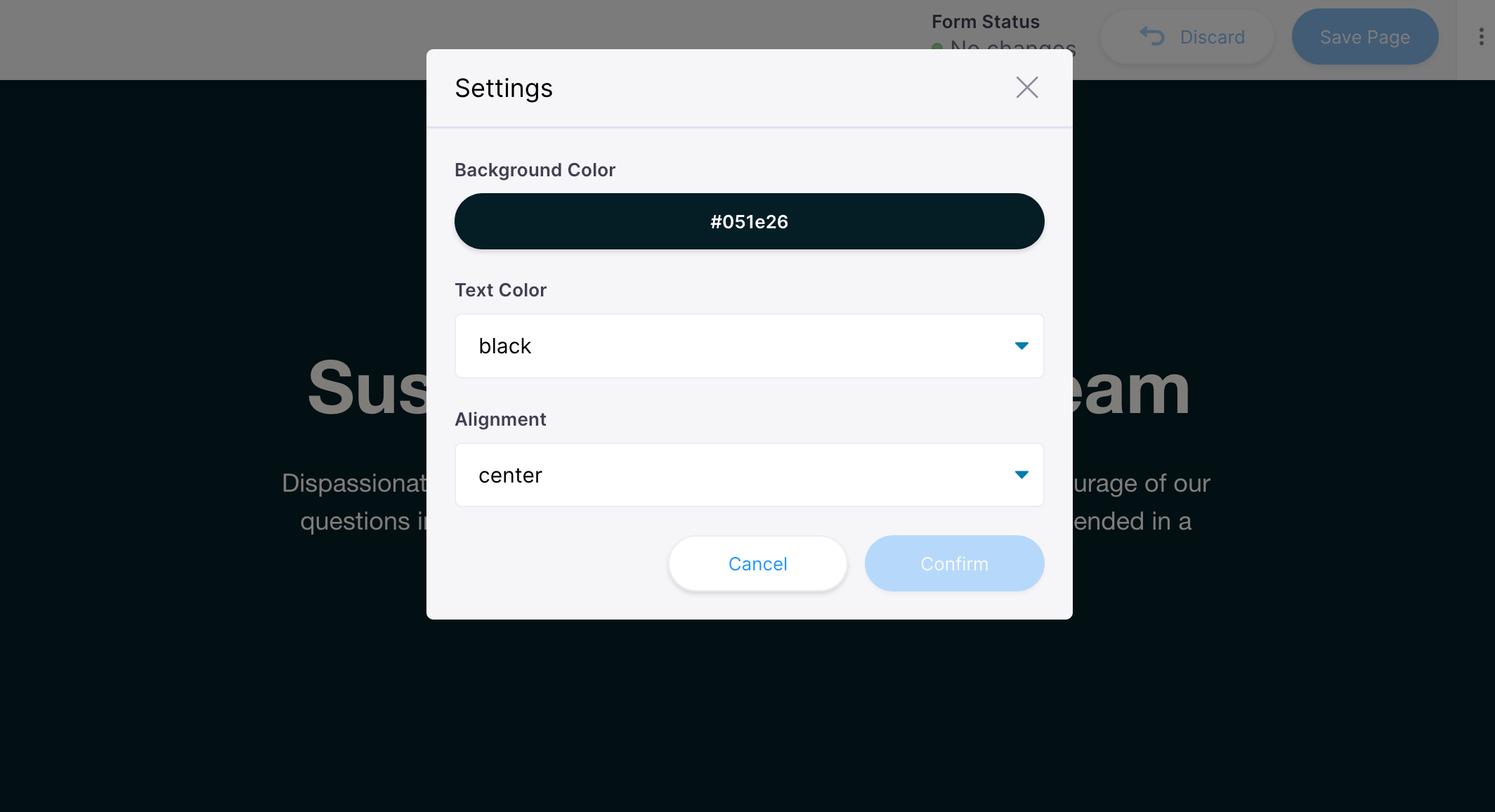
Our Hero block is coming along nicely, but it's pretty bare bones. Let's say we wanted to control the background color of the component. Or if we wanted to provide the option to 'align' the block contents. We would need to use a color or select field to edit these values.
This type of metadata is difficult to edit directly inline. To provide a way to edit this data in a more traditional form, you can pass in an array of Fields in the block template that will render in a Settings Modal.
Head to components/Hero.js and make these changes:
- Define the style props in
Hero - Add dynamic inline styles
- Pass the block's data to the Hero
- In the template, update block defaults
- Add fields to render in the modal
components/Hero.js
import React from 'react'
import { InlineTextarea, BlocksControls } from 'react-tinacms-inline'
import '../styles/hero.css'

/**
 * 1. Define the style props
 */
export function Hero({ text_color, background_color, align }) {
  /**
   * 2. Add dynamic inline styles on the 'hero' div
   */
  return (
    <div
      className="hero"
      style={{
        color: text_color || '#000',
        backgroundColor: background_color || 'aliceblue',
        textAlign: align,
        justifyContent: align === 'left' ? 'start' : align,
      }}
    >
      <div className="wrapper wrapper--narrow">
        <h1>
          <InlineTextarea name="headline" focusRing={false} />
        </h1>
        <p>
          <InlineTextarea name="subtext" focusRing={false} />
        </p>
      </div>
    </div>
  )
}

export const heroBlock = {
  /**
   * 3. Pass the block's data to the Hero
   */
  Component: ({ index, data }) => (
    <BlocksControls index={index} focusRing={{ offset: 0 }} insetControls>
      <Hero {...data} />
    </BlocksControls>
  ),
  template: {
    label: 'Hero',
    defaultItem: {
      headline: 'Suspended in a Sunbeam',
      subtext: 'Dispassionate extraterrestrial observer',
      /**
       * 4. Update defaults with style values
       */
      background_color: '#051e26',
      text_color: '#fffaf4',
      align: 'center',
    },
    fields: [
      /**
       * 5. Add fields to edit styles in modal
       */
      {
        name: 'background_color',
        label: 'Background Color',
        component: 'color',
        widget: 'block',
        colors: ['#051e26', '#f2dfc6', '#cfdcc8', '#ebbbbb', '#8a1414'],
      },
      {
        name: 'text_color',
        label: 'Text Color',
        component: 'select',
        options: ['white', 'black'],
      },
      {
        name: 'align',
        label: 'Alignment',
        component: 'select',
        options: ['center', 'left'],
      },
    ],
  },
}
If you restart the dev server, you should see a new 'pencil' icon in the Blocks Controls. If you click on that it will open the Settings Modal where the fields we defined will render.
You can add any Tina fields to the Settings Modal, just like you can in a regular sidebar form. This additional interface should allow you to cover your bases to edit page and block metadata.
Dynamic style approaches
In this example, we are setting the dynamic styles inline, but you could also use a css-in-js library to manipulate styles with these custom values. Or you could toggle class names based on the values.
There are many ways to approach this type of custom styling — it depends on the needs of your project!