Convert Hero to a Block
This simple inline editing configuration is a great start, but the end goal of this demo is to create a Home page built with Inline Blocks. In this step, we will add InlineBlocks to the homepage and convert our Hero into a block.
If you're wanting to get a better feel for the 'Blocks' concept, there is a great blog that dives deeper into what blocks are.
Add InlineBlocks
First we will add the InlineBlocks field to the home page. InlineBlocks accepts block options — blocks — and a path to the block data — name. It handles block order, among other things. Anytime you want to make blocks inline, you will need this parent component to house the blocks.
Head to Home.js and make these changes:
Home.js
import React from 'react'
import { useForm, usePlugin } from 'tinacms'
-import { InlineForm } from 'react-tinacms-inline'
+import { InlineForm, InlineBlocks } from 'react-tinacms-inline'
import data from './data/data.json'

export default function Home() {
  const formConfig = {
    id: './data/data.json',
    initialValues: data,
    onSubmit() {
      alert('Saved!')
    },
  }

  const [pageData, form] = useForm(formConfig)
  usePlugin(form)

  return (
    <div className="home">
      <InlineForm form={form} initialStatus="active">
        <Hero {...pageData} />
+       <InlineBlocks name="blocks" blocks={HOME_BLOCKS} />
      </InlineForm>
    </div>
  )
}

+ const HOME_BLOCKS = {/** We will define blocks here later */}
Take notice of the HOME_BLOCKS object. This object is fed to InlineBlocks, letting it know what block options are available to add.
Even though we added InlineBlocks to the page, nothing will render since there are no block options yet. Let's go make a block to add to these options.
Make a Component
Inline Blocks are made up of a component to render while editing and a template to configure defaults, add fields, and other required data.
Let's make the Block Component first:
components/Hero.js
import React from 'react'
// 1. Import 'BlocksControls'
import { InlineTextarea, BlocksControls } from 'react-tinacms-inline'
import '../styles/hero.css'

export function Hero() {
  //...
}

// 2. Define the block component with Hero
export const heroBlock = {
  Component: ({ index }) => (
    <BlocksControls index={index}>
      <Hero />
    </BlocksControls>
  ),
  template: {},
}
Here we're wrapping Hero in Block Controls to provide a UI for reordering, deleting, and adding new blocks. Notice the index being passed as props to BlockControls — this helps to keep track of the block order.
Make a Template
Our Hero block still needs a template to be complete. This template allows us to create the hero block type and provide default values for newly created blocks.
Add this code below the Hero component definition:
components/Hero.js
import React from 'react'
import { InlineTextarea, BlocksControls } from 'react-tinacms-inline'
import '../styles/hero.css'
export function Hero() {
//...
}
export const heroBlock = {
Component: ({ index }) => (
<BlocksControls index={index}>
<Hero />
</BlocksControls>
),
template: {
label: 'Hero',
defaultItem: {
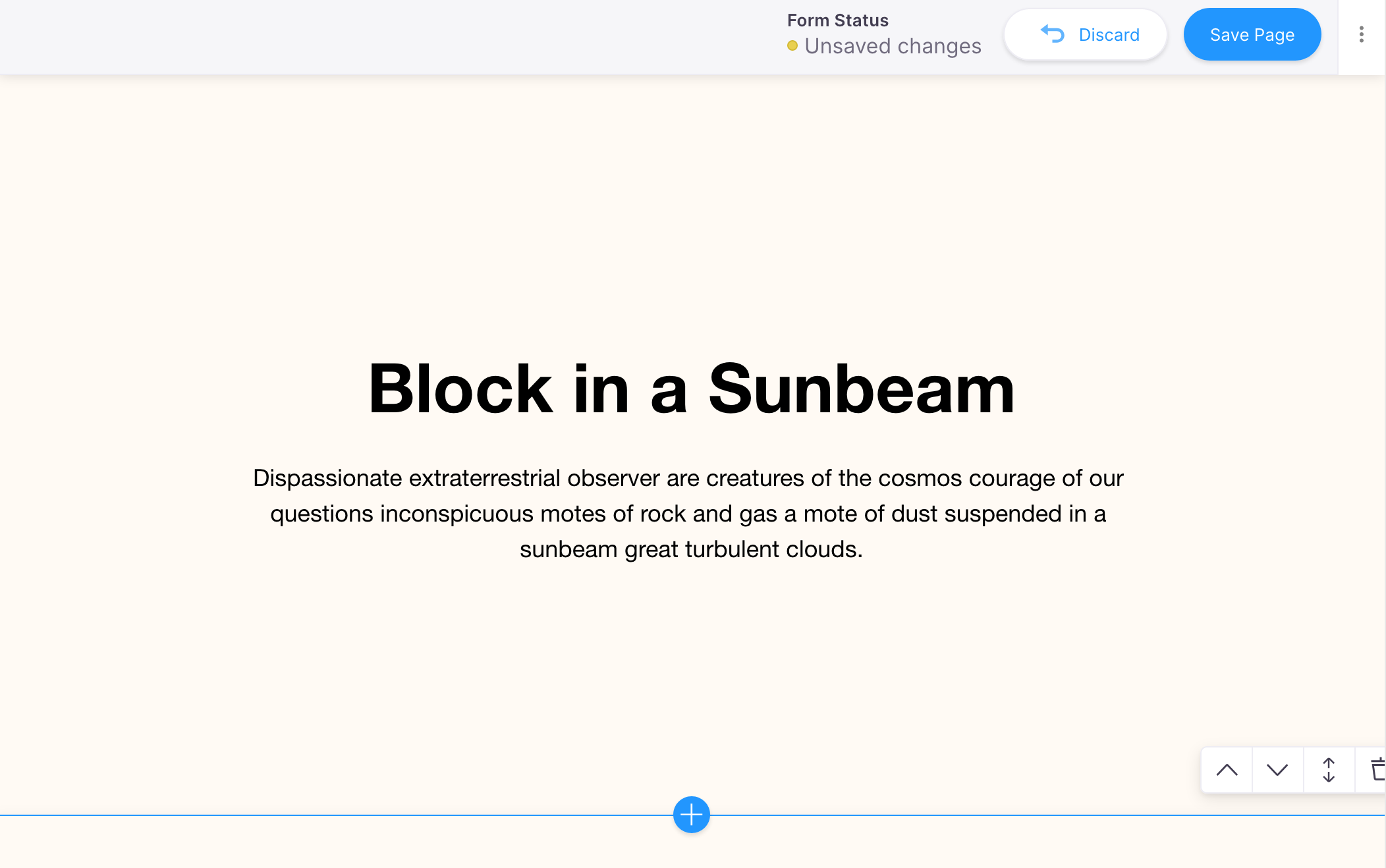
headline: 'Suspended in a Sunbeam',
subtext: 'Dispassionate extraterrestrial observer',
},
fields: [],
},
}The fields array is empty for now, but this is where we can add additional metadata to edit in a Settings Modal. We will cover this in a few steps.
Add heroBlock to Home
Finally, we will add the heroBlock to the HOME_BLOCKS mapping defined in Home.js. This defines a hero type block for the InlineBlocks to render.
Home.js
import React from 'react';
import { useForm, usePlugin, useCMS } from 'tinacms';
import { InlineForm, InlineBlocks } from 'react-tinacms-inline';
+import { heroBlock } from './components/Hero';
import data from './data/data.json';

export default function Home() {
  const cms = useCMS();
  const formConfig = {
    id: './data/data.json',
    initialValues: data,
    onSubmit() {
      cms.alerts.success('Saved!');
    },
  };

  const [, form] = useForm(formConfig);

  usePlugin(form);

  return (
    <div className='home'>
      <InlineForm form={form} initialStatus='active'>
-       <Hero {...pageData} />
        <InlineBlocks name='blocks' blocks={HOME_BLOCKS} />
      </InlineForm>
    </div>
  );
}

-const HOME_BLOCKS = {/** We will define blocks here later */}
+const HOME_BLOCKS = {
+  hero: heroBlock,
+};
Since heroBlock renders the hero component, we can remove the Hero right before InlineBlocks.
Restart the dev server and click on the hero block. You should see some new Blocks Controls UI. Try to add new hero blocks by hitting the 'plus' icon!
Even though we got this working, there's a few things to adjust. See how the controls bleed off the page? Let's fix that next.