Select Field
The select field represents a select element.
Options
| Option | Description |
|---|---|
component | The name of the plugin component. Always 'select'. |
name | The path to some value in the data being edited. |
options | An array of strings or Options to select from. |
label | A human readable label for the field. Defaults to the name. (Optional) |
description | Description that expands on the purpose of the field or prompts a specific action. (Optional) |
interface SelectField {
  name: string
  component: 'select'
  label?: string
  description?: string
  options: (Option | string)[]
}

type Option = {
  value: string
  label: string
}
This interfaces only shows the keys unique to the select field.
Visit the Field Config docs for a complete list of options.
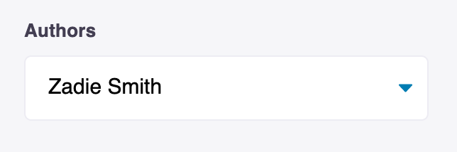
Example #1: Select an Author
Below is an example of how a select field could be used to select the author of a blog post
const BlogPostForm = {
  fields: [
    {
      component: 'select',
      name: 'frontmatter.authors',
      label: 'Author',
      description: 'Select an author for this post',
      options: ['Arundhati Roy', 'Ruth Ozeki', 'Zadie Smith'],
    },
    // ...
  ],
}
Example #2: Select a Heading Color
Below is an example of how a text field could be used to set the heading color for a blog post.
const BlogPostForm = {
  fields: [
    {
      component: 'color',
      name: 'heading_color',
      label: 'Heading Color',
      description: 'Select the color for the heading',
      options: [
        {
          value: '#ff0000',
          label: 'Red',
        },
        {
          value: '#000000',
          label: 'Black',
        },
      ],
    },
    // ...
  ],
}