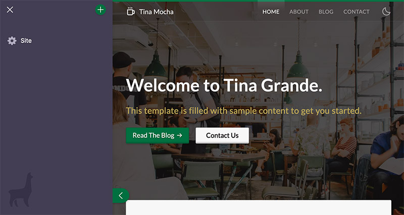
Screen Plugins
Screen Plugins allow you to render modal UI and handle various content editing needs. The purpose of these screens is to give a way to display information about the website that is not suited to inline or sidebar editing.
Example use cases may include:
- User Management
- CI build status
- Website Metadata e.g. SEO
- Layout Configuration such as Menus. For example, one might use a Screen Plugin to register a form to edit 'global site data'.
Interface
export interface ScreenPlugin<ExtraProps = {}> {
  __type: 'screen'
  name: string
  Component(props: ScreenComponentProps & ExtraProps): React.ReactElement
  Icon: any
  layout: 'fullscreen' | 'popup'
}

export interface ScreenComponentProps {
  close(): void
}| Option | Description |
|---|---|
__type | The name of the plugin. Always 'screen'. |
name | The text to be displayed in the form menu and at the top of the screen modal. |
Component | An array of fields that populate a modal form. Field values can populate new file data. |
Icon | A component to render in the form menu, next to the name. |
layout | Determines the modal layout. Defaults to popup. |
Name, Icon, & Component
The ScreenPlugin has three main pieces: a name, an icon, and a React Component. The name and icon can be used to list the screen plugin in a menu.
When the user clicks on the menu item, it opens a screen in which the React Component is rendered. Think of a screen as an empty canvas, it provides the space to create an editing interface beyond the sidebar.
Layout
There are two potential modal layouts for a screen plugin: fullscreen and popup. You can choose to utilize either depending on the purpose of the screen.
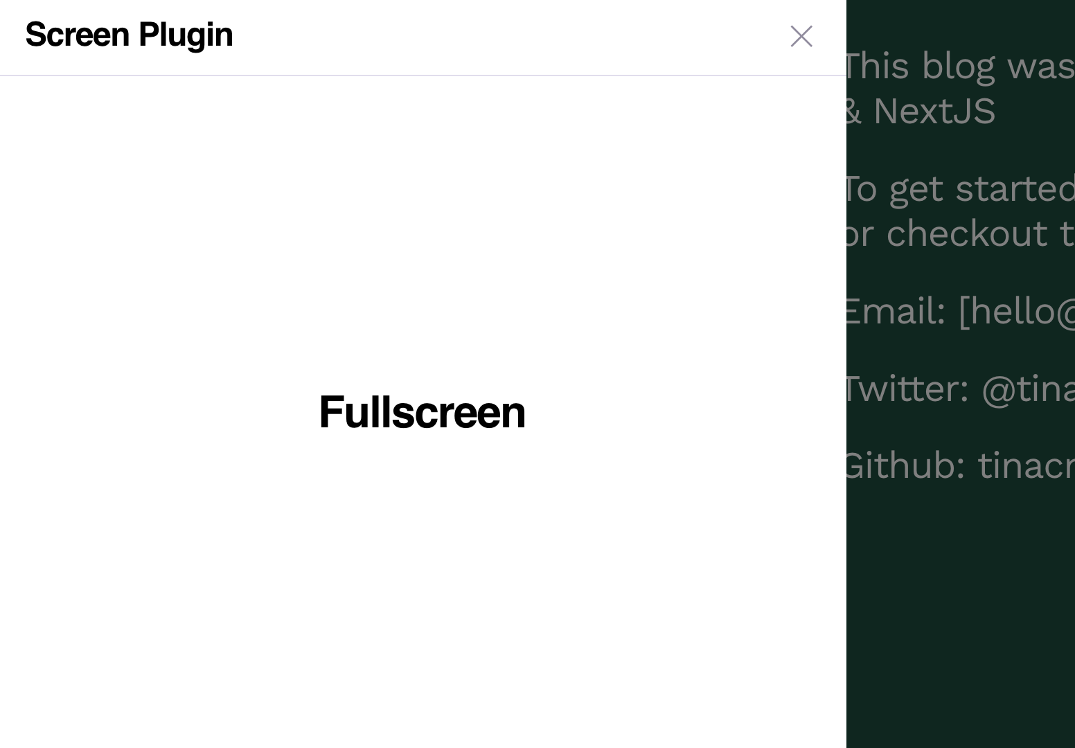
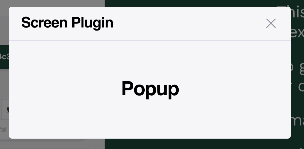
Within the modal, the name & Component are rendered.
Helpers
useScreenPlugin
useScreenPlugin creates a screen and registers the plugin with the CMS. It accepts a screen options object and dependencies to watch. If the dependencies update, the screen will update.
useScreenPlugin(options: ScreenOptions, deps: DependencyList): voidScreen Options
export interface ScreenOptions<ExtraProps = {}> {
  name: string
  Component: React.FC<ExtraProps & ScreenComponentProps>
  Icon: any
  layout?: ScreenPlugin['layout']
  props?: ExtraProps
}
Creating a Screen Plugin
Creating a Screen Plugin with the useScreenPlugin hook involves three steps:
- Import the
useScreenPluginhook fromtinacms - Create a custom
ScreenPlugin - Register the screen plugin with
useScreenPlugin
Example
// 1. Import `useScreenPlugin`
import { useScreenPlugin } from 'tinacms'

// 2. Define the screen plugin
const ScreenPlugin = {
  name: 'Example Screen',
  Component() {
    return <h1>This is a screen!</h1>
  },
  Icon: () => <span>🦙</span>,
  layout: 'popup'
}

export default function Page() {
  // 3. Register the plugin
  useScreenPlugin(ScreenPlugin)

  return (
      //...
  )
}
useFormScreenPlugin
useFormScreenPlugin creates and registers a new Screen Plugin that renders a form. This is a great place to put forms for content that doesn't belong on any particular page, for example with site metadata.
Tip: This hook creates what was previously called a Global Form.
Example
import { useFormScreenPlugin } from 'tinacms'
import { useJsonForm } from 'gatsby-tinacms-json'

function Layout(props) {
  // Create the form
  const [data, form] = useJsonForm(props.data.dataJson)

  // Register it as a Screen with the CMS
  useFormScreenPlugin(form)

  return <h1>{data.firstName}</h1>
}
You can also optionally pass an icon and a layout to useFormScreenPlugin. If these are not passed, then a default icon will be used, and the layout will be 'popup'.
Example
import { useFormScreenPlugin } from 'tinacms'
import { useJsonForm } from 'gatsby-tinacms-json'

function Layout(props) {
  // Create the form
  const [data, form] = useJsonForm(props.data.dataJson)
  const icon = () => <span>🦙</span>
  const layout = 'fullscreen'

  // Register it as a Screen with the CMS
  useFormScreenPlugin(form, icon, layout)

  return <h1>{data.firstName}</h1>
}
Further Readi
Last Edited: April 13, 2021