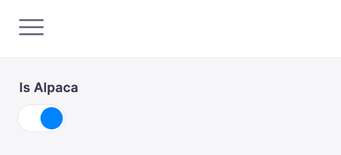
Toggle Field
Table of Contents
The toggle field represents a true/false toggle. This field is typically used for boolean content values. You could use this to toggle a certain feature on the page on or off.

Options
interface ToggleConfig extends FieldConfig {
  component: 'toggle'
  name: string
  label?: string
  description?: string
  toggleLabels?: boolean | { true: string; false: string }
}| Option | Description |
|---|---|
component | The name of the plugin component. Always 'toggle' |
name | The path to some value in the data being edited. |
label | A human readable label for the field. Defaults to the name. (Optional) |
description | Description that expands on the purpose of the field or prompts a specific action. (Optional) |
toggleLabels | Customize 'labels' next to the true / false states of the toggle. When true, the labels default to 'Yes' and 'No'. Alternatively, you can pass an object with the properties true and false with custom strings to render as labels. (Optional: Defaults to false) |
This interfaces only shows the keys unique to the date field.
Visit the Field Config docs for a complete list of options.
Example: Published Flag
Below is an example of how a toggle field could be used to mark a blog post as published.
const BlogPostForm = {
  fields: [
    {
      name: 'published',
      component: 'toggle',
      label: 'Published',
      description: 'Check to mark this to publish the post.',
      toggleLabels: {
        true: 'On',
        false: 'Off',
      },
    },
    // ...
  ],
}