Blocks Field
The Blocks field represents a list of items, similar to the Group List field, but allows each entity in the list to have a unique shape.
For an in-depth explanation of the Blocks field, read our "What are Blocks?" blog post. To see a real-world example of Blocks in use, check out the Tina Grande Starter.
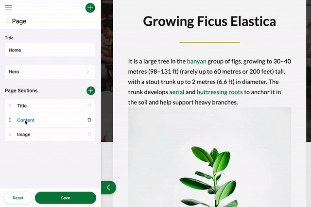
In the gif above, you see a list of Blocks: Title, Image, and Content. The form for this field could be configured like this:
const PageForm = {
  label: 'Page',
  fields: [
    {
      label: 'Page Sections',
      name: 'rawJson.blocks',
      component: 'blocks',
      templates: {
        'title-block': TitleBlock,
        'image-block': ImageBlock,
        'content-block': ContentBlock,
      },
    },
  ],
}
Each of the templates in this configuration represent a configuration object that looks more or less like a top-level form configuration object.
/*
 **  Block template definition for the content block
 **/
export const ContentBlock = {
  label: 'Content',
  key: 'content-block',
  defaultItem: {
    content: '',
  },
  fields: [{ name: 'content', label: 'Content', component: 'markdown' }],
}
The source data for the ContentBlock might look like the example below. When new blocks are added, additional JSON objects will be added to the blocks array:
{
  "blocks": [
    {
      "content": "**Billions upon billions** are creatures of the cosmos Orion's sword cosmic fugue at the edge of forever science?",
      "_template": "content-block"
    }
  ]
}
Blocks Field Options
import { Field } from '@tinacms/core'

interface BlocksConfig {
  name: string
  component: 'blocks'
  label?: string
  description?: string
  templates: {
    [key: string]: BlockTemplate
  }
}| Option | Description |
|---|---|
component | The name of the plugin component. Always 'blocks'. |
name | The path to some value in the data being edited. |
label | A human readable label for the field. Defaults to the name. (Optional) |
description | Description that expands on the purpose of the field or prompts a specific action. (Optional) |
templates | A list of Block templates that define the fields used in the Blocks. |
Block Template Options
interface BlockTemplate {
  label: string
  key: string
  fields: Field[]
  defaultItem?: object | (() => object)
  itemProps?: (
    item: object
  ) => {
    key?: string
    label?: string
  }
}| Option | Description |
|---|---|
label | A human readable label for the Block. |
key | Should be unique to optimize the rendering of the list. |
fields | An array of fields that will render as a sub-menu for each group item. The fields should map to editable content. |
defaultItem | A function to provide the block with default data upon being created. (Optional) |
itemProps | A function that generates props for each group item. It takes the item as an argument. (Optional) It returns an object containing,
|
This interfaces only shows the keys unique to the blocks field.
Visit the Field Config docs for a complete list of options.