Inline Blocks
Inline Blocks combine the content modelling flexibility of regular Blocks with the improved editing experience of Inline Editing.
Learn about Inline Blocks in a step-by-step guide!
Creating a Block
A block is made of two parts: a component that renders in edit mode, and a template to configure fields, defaults and other required data.
interface Block {
  Component: React.FC<BlockComponentProps>
  template: BlockTemplate
}
Part 1: Block Component
import { BlocksControls, InlineTextarea } from 'react-tinacms-inline'

// Example 'Heading' Block
export function Heading(props) {
  return (
    <BlocksControls index={props.index}>
      <InlineTextarea name="text" />
    </BlocksControls>
  )
}
The Block Component is passed name, a unique identifier and path in the source data, index, its position in the block order, and data, the source data.
interface BlockComponentProps {
  name: string
  index: number
  data: any
}
Since it renders in 'edit mode,' this component should display BlocksControls and at least one Inline Field. BlocksControls is the UI for editing, deleting, or moving blocks. An Inline Field is, at its most basic, an input field stripped of styling to blend in with the site.
Blocks Controls Options
Interface
interface BlocksControlsProps {
  index: number
  insetControls?: boolean
  focusRing?: boolean | FocusRingProps
  label?: boolean
  children: React.ReactNode
}

interface FocusRingProps {
  offset?: number | { x: number; y: number }
  borderRadius?: number
}| Key | Description |
|---|---|
index | The index of the block associated with these controls. |
insetControls | A boolean to denote whether the group controls display within or outside the group. |
focusRing | Either an object to style the focus ring or a boolean to show/hide the focus ring. Defaults to true which displays the focus ring with default styles. For style options, offset (in pixels) sets the distance from the ring to the edge of the component, and borderRadius (in pixels) controls the rounded corners of the focus ring. |
label | A boolean to control whether or not a block label is rendered. |
children | Any child components, typically inline field(s). |
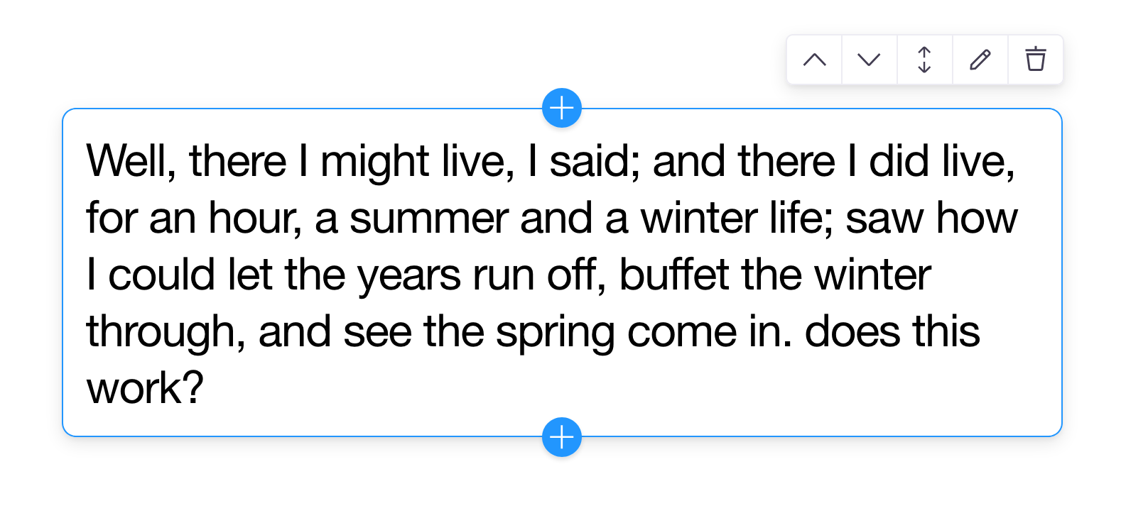
The image above shows the InlineTextarea field in use with Blocks Controls.
Additional Available Inline Fields:
Part 2: Block Template
export const heading_template = {
  label: 'Heading',
  defaultItem: {
    text: 'At vero eos et accusamus',
  },
  fields: [],
}
The Inline Block Template configures the block with the CMS. It has a similar shape to a Regular Block Template definition.
Interface
interface BlockTemplate {
  label: string
  defaultItem?: object | (() => object)
  fields?: Field[]
}| Key | Purpose |
|---|---|
label | A human readable label. |
defaultItem | Optional — Populates new blocks with default data. |
fields | Optional — Populates fields in the Settings Modal. |
Configuring Inline Blocks with Inline Form
The initial steps to configuring Inline Blocks involve setting up an Inline Form on the page or component where the blocks should render. Then, you should add controls to handle editing state. Finally, you can use a component called InlineBlocks that renders blocks in order based on the source data.
The Steps:
- Wrap your component with
InlineForm, pass theformobject. - Configure
InlineBlocks, pass thenameandblocksvalues.
import { useJsonForm } from 'next-tinacms-json'
import { InlineForm, InlineBlocks } from 'react-tinacms-inline'
import {
  BodyCopy,
  body_copy_template,
  Heading,
  heading_template,
  Image,
  image_template,
} from './blocks'

/*
 ** Example 'PageBlocks' Component
 */

export default function PageBlocks({ jsonFile }) {
  // Creates the form
  const [, form] = useJsonForm(jsonFile)

  return (
    <InlineForm form={form}>
      <InlineBlocks name="blocks" blocks={PAGE_BLOCKS} />
    </InlineForm>
  )
}

/*
 ** Multiple blocks are grouped into a single object,
 ** with their associated Component and template values.
 ** This object is passed to InlineBlocks
 */

const PAGE_BLOCKS = {
  heading: {
    Component: Heading,
    template: heading_template,
  },
  body_copy: {
    Component: BodyCopy,
    template: body_copy_template,
  },
  image: {
    Component: Image,
    template: image_template,
  },
}
InlineBlocks Interface
To be configured properly, InlineBlocks requires name and blocks.
interface InlineBlocksProps {
  name: string
  blocks: {
    [key: string]: Block
  }
  className?: string
  direction?: 'vertical' | 'horizontal'
  itemProps?: {
    [key: string]: any
  }
  min?: number
  max?: number
}| Key | Purpose |
|---|---|
name | The path to the source data for the blocks. |
blocks | An object composed of individual Blocks. |
className | Optional — To set styles directly on the input or extend via styled components. |
direction | Optional — Sets the orientation of the drag direction and AddBlock button position. |
itemProps | Optional — An object that passes additional props to every block child element. |
min | Optional — Controls the minimum number of blocks. Once reached, blocks won't be able to be removed. (Optional) |
max | Optional — Controls the maximum number of blocks allowed. Once reached, blocks won't be able to be added. (Optional) |
Blocks Source Data
The source data for the blocks in the example above could look something like this:
// Example blocks JSON source file
{
  "blocks": [
    {
      "_template": "image",
      "src": "/img/bali-1.jpg",
      "alt": "bali-viaje"
    },
    {
      "_template": "heading",
      "text": "Ne quaesiveris extra."
    },
    {
      "_template": "body_copy",
      "text": "Sed ut perspiciatis unde omnis iste natus error."
    }
  ]
}
The key ("blocks" in this example) for the array of individual blocks must match the name value passed to InlineBlocks.
Each individual block object must have a _template value to connect its data with a block template. This value should match the name of the block when defined.
Example
const PAGE_BLOCKS = {
  /**
   * The `_template` value in the source
   * data should be 'heading'
   */
  heading: {
    Component: Heading,
    template: heading_template,
  },
  /**
   * The `_template` value in the source
   * data should be 'body_copy'
   */
  body_copy: {
    Component: BodyCopy,
    template: body_copy_template,
  },
}
Using the Settings Modal
There may be times when a Block needs more field inputs than a single inline field. For example, an image may need a field for the ‘alt’ tag. For this metadata, you can use ModalProvider and add additional fields to the Block Template.
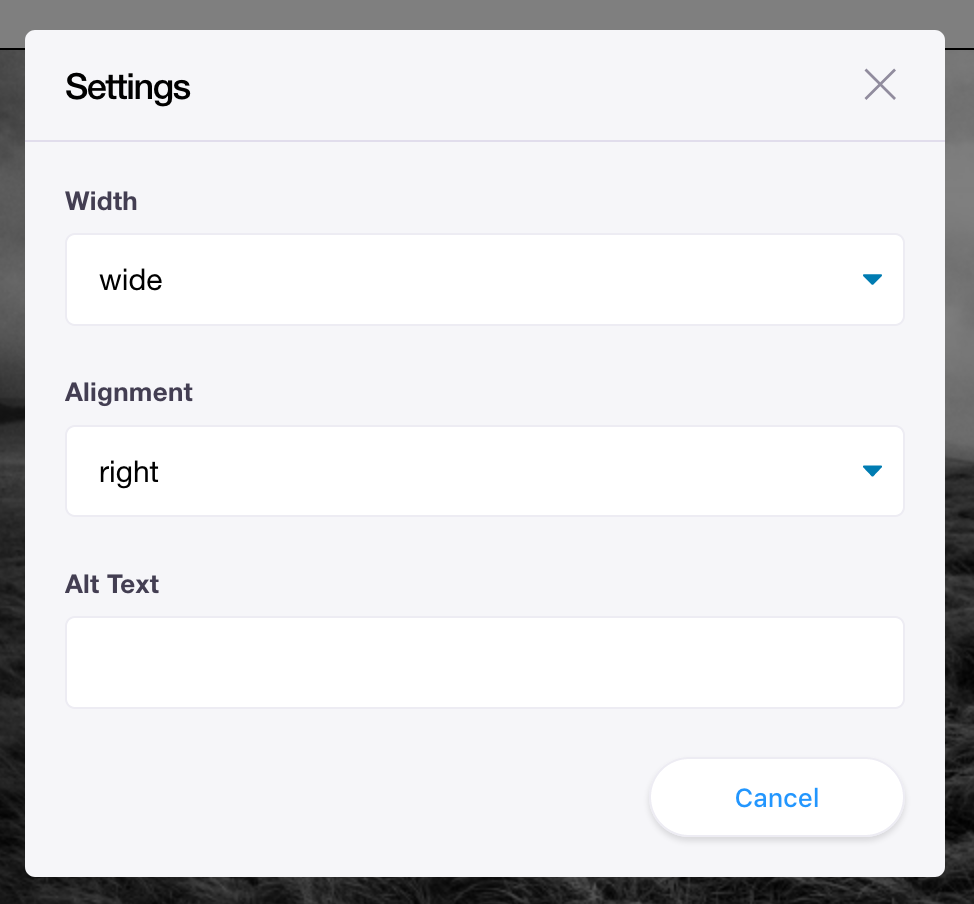
1. Define Fields in the Block Template
Field definitions added to the fields property will render in the Settings Modal. These fields are defined exactly the same as regular sidebar fields.
const image_template = {
  label: 'Image',
  defaultItem: {
    src: '/img/bali-1.jpg',
    alt: '',
  },
  /*
   ** Define fields to render
   ** in a Settings Modal form
   */
  fields: [
    {
      name: 'alt',
      label: 'Alt Text',
      component: 'text',
    },
  ],
}
2. Use the field data in your Block Component
You can then use that field data in the Block Component. In this example, the data will populate the alt attribute for the image.
export function Image({ data, index }) {
  return (
    <>
      <div>
        <BlocksControls index={index}>
          <InlineImage
            name="src"
            previewSrc={fieldValue => `public${fieldValue}`}
            parse={media => `/img/${media.filename}`}
            uploadDir={() => '/public/img/'}
            alt={data.alt}
          />
        </BlocksControls>
      </div>
    </>
  )
}
3. Add the ModalProvider
To use the ModalProvider, wrap it around the InlineForm that renders InlineBlocks. This will provide the Settings Modal view. The fields defined in the block template will populate the form in that modal.
import { useJsonForm } from 'next-tinacms-json'
import { ModalProvider } from 'tinacms'
import { InlineForm, InlineBlocks } from 'react-tinacms-inline'

export default function IndexBlocks({ jsonFile }) {
  const [, form] = useJsonForm(jsonFile)

  // Wrap InlineForm with the ModalProvider
  return (
    <ModalProvider>
      <InlineForm form={form}>
        {/*
         ** //...
         */}
      </InlineForm>
    </ModalProvider>
  )
}
Additional Reading
- A blog — What are Blocks
- A guide — Working With Inline Blocks
- Interested in Nested Blocks?
- Recap on general Inline Editing and Inline Fields