Text Field
Table of Contents
The text field represents a single line text input. It should be used for content values that are short strings: for example, a page title.
Options
interface TextConfig extends FieldConfig {
  component: 'text'
  name: string
  label?: string
  description?: string
  placeholder?: string
}| Option | Description |
|---|---|
component | The name of the plugin component. Always 'text'. |
name | The path to some value in the data being edited. |
label | A human readable label for the field. Defaults to the name. (Optional) |
description | Description that expands on the purpose of the field or prompts a specific action. (Optional) |
placeholder | Placeholder text to appear in the input when it empty. (Optional) |
This interfaces only shows the keys unique to the text field.
Visit the Field Config docs for a complete list of options.
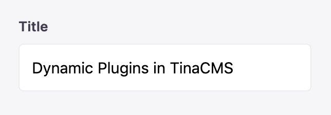
Example: Blog Post Title
Below is an example of how a text field could be used to edit the title of a blog post.
const BlogPostForm = {
  fields: [
    {
      component: 'text',
      name: 'title',
      label: 'Title',
      description: 'Enter the title of the post here',
      placeholder: '...',
    },
  ],
}